
How to improve your website conversion rate in 2026
.png)


The average website converts just 2 to 5 percent of visitors, so most sites let the majority leave without acting. That's rarely a traffic problem, it's a conversion problem, and it usually comes down to how the site is built. What moves the needle: diagnose where your funnel leaks with data, get speed right since over half of visitors leave a slow site, and make your value clear in seconds. Cut friction in forms, build trust with social proof, win on mobile, and only then test.
Most websites have a conversion problem, not a traffic problem
Here’s a number worth sitting with: the average website converts somewhere between 2 and 5 percent of its visitors. That means for every 100 people who arrive, 95 or more leave without doing the one thing the site was built for. Most companies respond by trying to get more visitors. But if 95 percent of your current traffic leaves without converting, more traffic just means more people leaving. That’s not a traffic problem. It’s a conversion problem, and it’s usually a cheaper, faster one to fix.
Conversion rate optimization is the work of figuring out why visitors don’t act, and systematically fixing it. The important and often overlooked part is that most of the reasons live in how the site is built: how fast it loads, how clearly it communicates, how easy it is to take the next step. You can improve conversion dramatically before you ever run a formal test, simply by getting those fundamentals right. This guide walks through them in order of impact, and it’s written for people who care about turning existing visitors into leads and customers, not chasing vanity traffic.
Start by finding where your funnel leaks
The most common CRO mistake is starting with someone’s gut feeling about what’s broken. That’s expensive guesswork. Before changing anything, find out where visitors actually drop off, using data. Tools like Google Analytics show you which pages lose the most people, and free tools like Microsoft Clarity or Hotjar add heatmaps and session recordings that reveal where users get stuck, rage-click, or never scroll. The principle underpinning all good CRO is simple: every decision should be driven by evidence, not assumption.
Start where the drop-offs are biggest, and on the pages that matter most. Optimizing a blog post’s footer button is far lower value than fixing your main product or pricing page. And establish your baseline first, your current conversion rate, so you can tell whether changes are actually helping. Once you know where the leaks are and which pages carry the weight, you can fix the right things instead of guessing. Everything that follows is most powerful when you’ve pointed it at the real problem.
The fundamentals that move conversion
Get these right, in order of impact, and most sites improve before any formal testing.
Speed is the foundation
No conversion tactic survives a slow website. Over half of visitors will abandon a page that takes more than about three seconds to load, so speed isn’t a technical nicety, it’s one of the highest-impact conversion levers you have. A fast site creates a positive first impression and keeps people moving toward the action; a slow one loses them before they see your offer. Measuring and improving your Core Web Vitals is a foundational step, and Google’s own free tools show you exactly where the bottlenecks are.
This is also where how your site is built matters more than any plugin. A site with clean, lightweight code and optimized assets is fast by default, while a site weighed down by heavy scripts and bloated third-party tools fights an uphill battle no amount of CTA tweaking will win. Getting speed right at the foundation, in how the site is actually constructed, pays off across every page and every conversion goal. It’s the least glamorous item on this list and one of the most decisive.
Clarity: message and design
Once your site is fast, the next question is whether visitors understand it. People decide within seconds whether a page is worth their attention, and if your value proposition isn’t clear almost immediately, they leave, no matter how good the underlying product is. Clarity is one of the most underrated conversion tools there is.
A few principles do most of the work. Lead with clarity: your headline and main copy should be instantly understandable, not clever at the expense of clear. Focus on benefits over features: visitors want to know what they’ll gain, not just what your product technically does. And make your calls to action explicit: “Get my free demo” beats a generic “Submit” every time, because it tells people exactly what happens next. Good design serves this by guiding the eye toward the action rather than competing with it. When the message is clear and the design points at the next step, conversion gets easier without any trickery.
Reduce friction, especially in forms
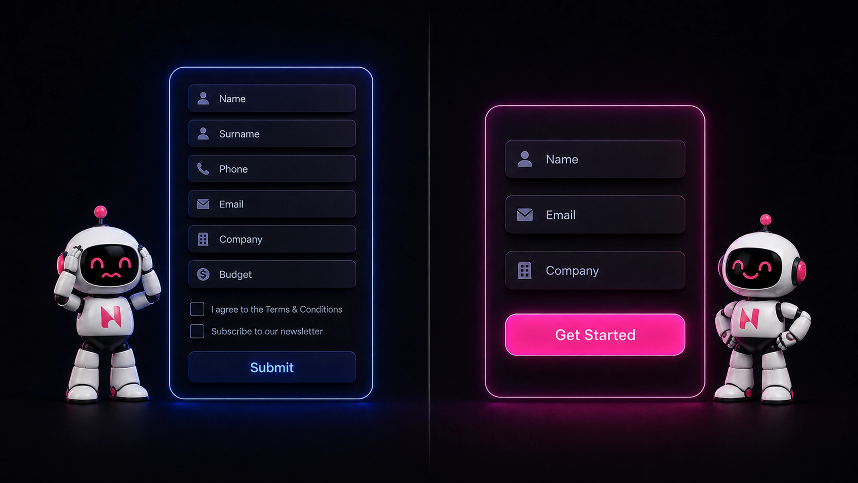
Every bit of friction between interest and action costs you conversions, and forms are usually where the most friction hides. The single most reliable improvement is to ask for less: every additional field is another reason to abandon the form. A service business that asks for name, phone, email, company, and budget all at once will convert far fewer people than one that starts with just name, email, and message. If you don’t genuinely need a field to take the next step, cut it. (We go deeper on this in our guide to Webflow forms.)
Friction shows up elsewhere too: confusing navigation, too many choices, unclear next steps, unexpected costs revealed late. The goal throughout is to make the path from interest to action as short and obvious as possible. Every extra click, every moment of confusion, every unnecessary decision is a place you lose people. Removing friction is often the fastest conversion win available, because you’re not adding anything, you’re taking away what was getting in the way.
Build trust
People don’t convert on sites they don’t trust, especially in B2B, where the decision carries real risk and budget. Trust signals are what turn a hesitant visitor into one willing to act. The most effective is social proof: testimonials, client logos, reviews, case studies, and any evidence that other people, ideally people like your visitor, have used you and been glad they did. Seeing that others made the same decision successfully lowers the perceived risk of doing it yourself.
Smaller touches matter too. Reassuring microcopy near forms and buttons, a privacy note, a guarantee, a line about what happens after they click, quietly removes anxiety at the moment of decision. None of this is a bonus layer on top of conversion; it’s a core part of it. Design and psychology work together, and a page that feels credible and reassuring converts better than an identical page that doesn’t, even when nothing else changes.
Mobile is where most visitors decide
Mobile devices now account for the majority of web traffic, well over half, which means for most sites the mobile experience is the main experience, not a secondary one. A site that converts well on desktop but is awkward on a phone is leaking most of its potential, because most people are meeting it on that phone first.
Mobile optimization goes beyond a responsive layout. It means fast load times on mobile connections, tap targets that are easy to hit, forms that are painless to complete on a small screen, and a value proposition and CTA that are clear without pinching or zooming. The test is simple: go through your own site on your phone as a first-time visitor would, and fix every point of friction you hit. Given where your visitors actually are, a flawless mobile experience isn’t optional, it’s where most of your conversions are won or lost.
Then, and only then, test
Once the fundamentals are solid, A/B testing is how you refine further, and it genuinely helps. Testing two versions of a page against real user behavior lets you replace guesswork with evidence and make steady, compounding gains. It’s a valuable discipline, and worth building into how you operate over time.
But the order matters. Testing is most powerful once your site is already fast, clear, low-friction, trustworthy, and strong on mobile, because you’re refining a solid foundation rather than testing button colors on a page that loads slowly and confuses people. A note on tooling, too: the bottleneck for most teams isn’t the number of tools, it’s strategy and understanding of their users. You don’t need six platforms. One analytics tool, one heatmap tool, one testing tool, and genuine attention to how your visitors behave will take you further than any stack. Fix the foundation first, then test to sharpen what’s already working.

Conversion is a program, not a project
The last thing to understand is that conversion optimization isn’t a one-time fix. A project has an end date; improving conversion is an ongoing capability, a habit of using data to keep making the site better at turning visitors into customers. And it compounds: a 10 percent improvement one quarter followed by another the next doesn’t add, it multiplies. The businesses that see dramatic gains are the ones that commit to the process rather than treating it as a single audit.
So start with the highest-impact fundamentals, speed, clarity, friction, trust, and mobile, pointed at the pages where your data shows the biggest leaks. Get those right and most sites see meaningful improvement before any formal testing begins. Then keep going: measure, refine, and treat conversion as a continuous part of how you run your site. That combination, a well-built foundation plus ongoing improvement, is what turns a website from a brochure that looks nice into one that reliably produces leads and customers.
Frequently Asked Questions

Unlock the power
of
today